

Derelict's new GUI
Submitted by Earok on Sat, 02/26/2011 - 18:44One of the main areas of focus for the Earok 2011 Collection update of Derelict is the GUI. Take a look at the old version:
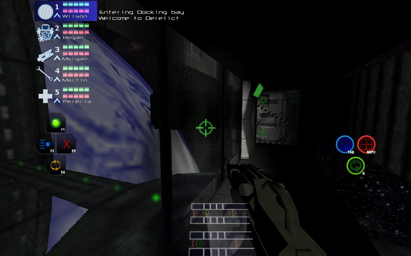
Asides from the general ugliness, the problem with this version primarily the clutter. Total information overload with numbers and text everywhere. So here's the solution I came up with:
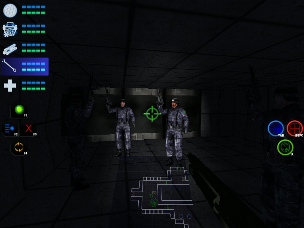
I redesigned the GUI more or less from scratch, and Cobra gave the new icons a graphical overhaul. Blue bar represents your ammo, green bar represents your health. Much easier to see at a glance if anyone needs attention, than having to read all ten values (Also, the bars flash if you have low health/ammo). The icons that command your team are on the left, and the icons that control your current marine are on the right. Although each icon lists the Key required for that command, the shape of the icon is also representative of the required button on the Xbox 360 controller.
Comments
Much better!
Cheers Sam.
Looks great!
Thanks Gui!